Rachel Turney - author, Advocate, Aesthete

-
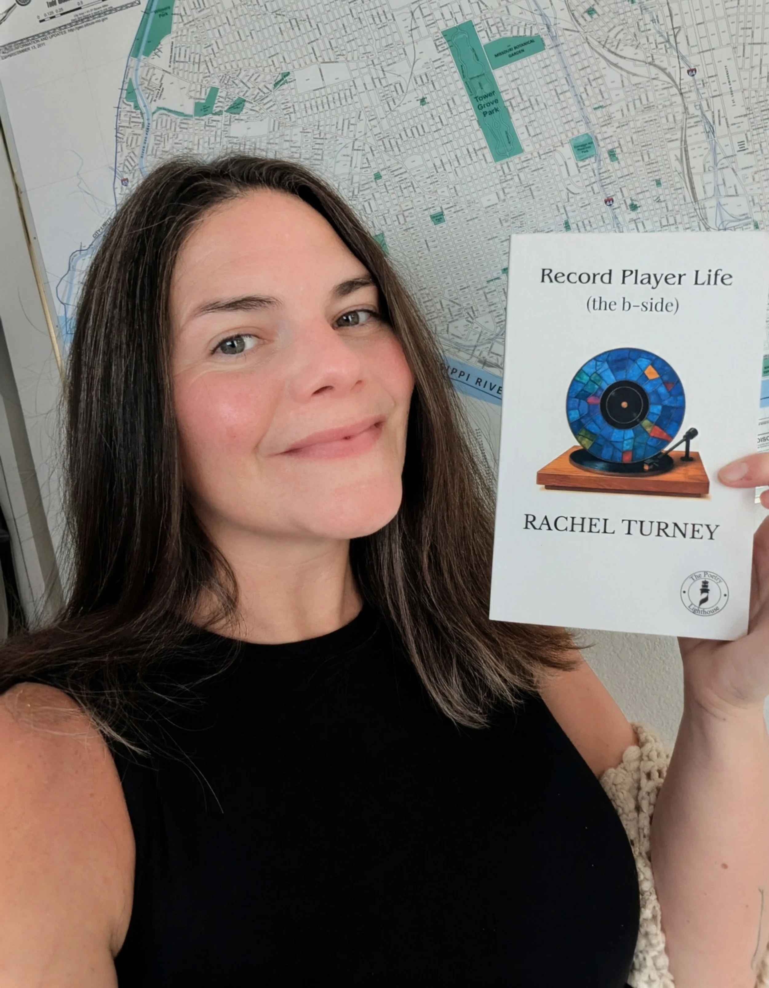
Poetry (in Brief) has a logo! Thank you to my sister, who is a marketing strategist with a global organization, Olivia Turney! We worked on this logo for about a week and chose the font Chaparral by Carol Twombly. The pause button represents time and slowing down. The circle is about connection. The specific blue we chose is the exact same as the color used in the Pride Rainbow Flag. This is a nod to the inclusiveness I want my organization to represent. The title of my project, Poetry (in Brief), I chose in the fall of 2025. My vision was to create a community for busy poets where we could positively contribute to each other's lives and work. I am expanding this mission with Poetry (in Brief) the magazine.
-
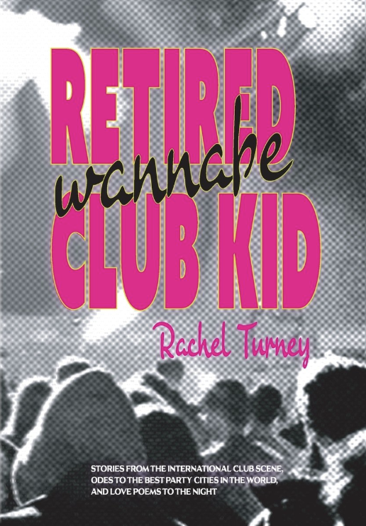
Request: Can you ask your local library to order Retired Wannabe Club Kid?
Support divergent literature, a unique and inclusive press Parlyaree, and me - your favorite poetry friend! (If I have called you my friend ... I mean it. It's my "I love you.")
Heart Reasons: This book is for the little unseen weirdos and I hope to provide access to some lost teen or grown who stumbles upon it.
Logistical Reason: Hardback books survive better in our library systems and if they lose their shelf spot they are more likely to find a forever home with a patron in a sell-off.
Parlyaree is releasing the paperback next month so time is of the essence to provide the library with just the hardback option.
Thank you and please let me know how I can help you! I am happy to order your book at my local library (limited spots) or support you in another way. Let me know!